Tyson and BindTuning recently presented the following solution at the Intra.NET Reloaded Boston conference and won the 2018 Intra.NET Awards’ Best Intranet Solution for User Experience, Design & Content Management. This is a prestigious award that recognizes, celebrates and honors exceptional intranet projects.

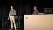
Last year at Microsoft Ignite in Orlando, it was my pleasure to give a joint presentation with Charles Norman II (watch the full presentation below).
Essentially, we shared Tyson’s journey of transforming their outdated, ineffective intranet to one that met the requirements of their modern workforce.
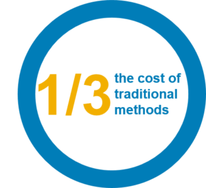
 By Charles’ estimation, together we were able to achieve Tyson’s business objectives in ½ the time and at 1/3 of the cost compared to a traditional, custom intranet project! During our session, Charles talked through a few of the notable issues Tyson was having with their existing intranet, some of which I have summarized below:
- Department Driven: the intranet was structured by department which made important information difficult to find. If a user didn’t understand the org chart and each team’s responsibilities (which is a moving target in any company), they’d struggle to find the content and tools they needed to do their jobs. Tyson understood that this strategy just wasn’t working for their employees and that they wanted to shift the focus of their intranet to the end user, giving them easy access based on how they work, rather than by department.
- Mobile Unfriendly: the intranet could only be accessed onsite or with VPN, which led to important content being inaccessible outside of business hours or on mobile devices. And let’s face it, todays modern workforce is on the go, accessing the tools they need on any device at any time. Tyson recognized mobile accessibility was an absolute must have for this project.
- Mixed Content: information was hard to find because many sites had been around for 10+ years and had accumulated a mass of outdated and non-relevant content. For example, when users did a search for content, they could easily be presented with hundreds or thousands of options – leaving them frustrated. Splitting the team and public content ensured that non-team members could easily find important information (on the intranet) and teams had designated areas for collaboration (team sites/Groups/Teams) – a win win for everyone!
- Multiple Intranets: due to previous acquisitions, intranet content was spread across multiple SharePoint environments (on-premises and Office 365) that each required individual maintenance. For users, this meant they often didn’t know which environment to access for what purpose or how to navigate between them effectively – a total drain on their time. Consolidating the environments into a single intranet improved the experience for end users as well as limited the number of farms that required maintenance and accumulated costs.
- Inconsistent UX: lack of governance and global navigation as well as multiple farms meant that the user experience was different across nearly every intranet site. Bringing all intranet content into a single SharePoint environment with governance and standards for page/content creation and management ensured a consistent look and feel while allowing for creativity.
- Poor Search Experience: a combination of overly shared, untagged/unstructured, and outdated content meant that users were unable to find relevant information through search – which resulted in users saying that search was “broken”. We all know once users label something as “broken” they stop using it – not a good situation. Instead of continuing to apply band-aids, the content needed to be analyzed, restructured, and tagged in a way that surfaced important information at the top of search results.
Do these pain points sound familiar?
In our session, Charles walked through the process they followed to compare different options (including pros/cons of each) such as Intranet-as-a-Service, full custom or pre-built and how they ultimately decided on utilizing Dell Consulting Services and BindTuning themes and web parts.
Tyson had 3 primary goals for the project:
- Mobile and device friendly
- Significantly better user experience; this had to be a tool that helped their team members be productive
- User enablement; users needed to be able to work anywhere on any device with access to what they need at any time

Alongside those primary goals Tyson wanted to make sure they had governance in place so that they could manage and maintain the intranet. By creating a consistent and user/function focused intranet, they reduced the amount of time and training it took to become productive with it. And last but not least, with multi-factor authentication, they added a layer of security with Microsoft Authenticator app – making the user experience easy and secure.
The beauty of this project is that we built Tyson’s intranet without any customization – yes, that’s right, no customization so that it would be very easy for Tyson to maintain. Besides leveraging pre-built BindTuning themes and web parts, we used Office 365 / SharePoint Online, SharePoint on-premises, SharePoint Designer, Microsoft Flow, Azure Application Proxy, Azure Multi-Factor Authentication and a Metalogix Migration tool. In all, the project took a total of 20 weeks to deliver Tyson the intranet that met all their objectives.
But don’t just take my word for it, watch the full presentation Charles and I gave at Microsoft Ignite and hear it in his own words.
If your company is experiencing some of the issues described above and are looking to avoid a lengthy, costly, custom intranet project, learn more by reading our Dell Services for Digital Workplace Portal service overview. We’d be happy to discuss how we can help you too! If you’re interested in learning more, either contact your Dell representative or comment below and I will respond back to you.
